Three vertical banners flapping in the wind against a clear blue sky, mounted on tall poles. From left to right, the banners are in shades of grey, lighter grey, and black, each with the 'amico' logo in large letters. The logo on the grey banners is in black text, while the logo on the black banner is in white text. The banners represent the 'amico' brand, suggesting an outdoor advertising or branding presence.
LashJoy
Innovation right in front of your eyes.
2022
Branding & Design
Photography
Beauty

The client:

LashJoy has revolutionised the lash game. They’ve empowered over 50,000 lash stylists across the globe with the slickest lash products and game-changing education. Led by industry GOAT Joy Crossingham, their mission is to elevate lash artists everywhere with unparalleled products and elite education.

The challenge:

LashJoy’s core challenge was improving brand positioning and remaining relevant in an industry driven by aesthetics. With a brand identity lagging behind the times and not adaptable to their ever growing digital marketing demands, they needed to enter a new era with their look and feel.

The solution:

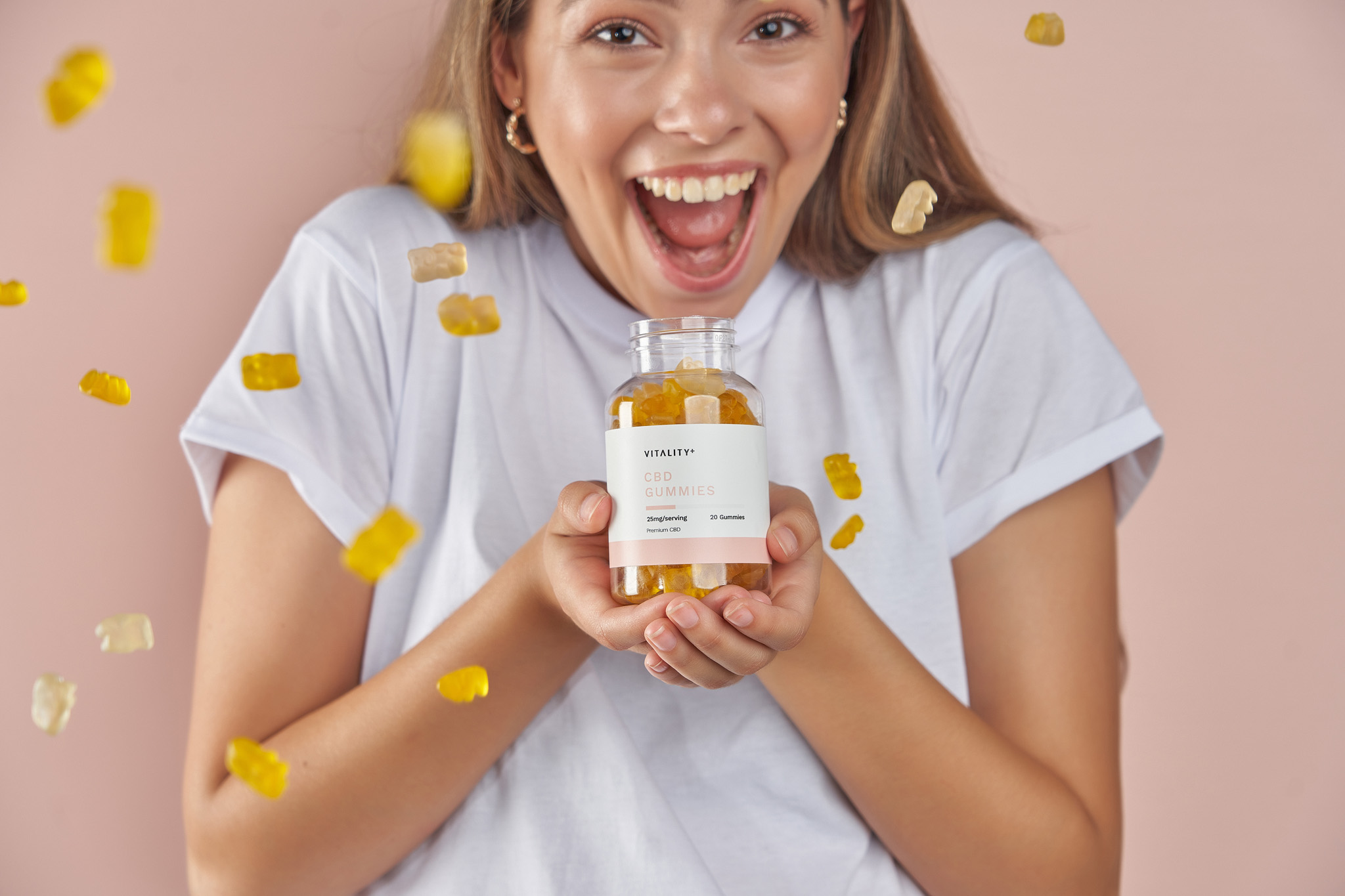
After years of partnership and an intimate connection to the niche lash and brow industry, ShareStory developed a strategy with LashJoy and performed a comprehensive refresh of the brand. Executing the identity design, packaging design and the commercial branded content. Before ecommerce development partners were procured for the completion of the shopify website.

A before and after comparison of a company logo. The 'Before' image shows the word "amico" in lowercase with a stylized 'm' resembling a sine wave, in black and mustard yellow colors, followed by the text "DEVELOPMENTS" in grey uppercase letters. The 'After' image displays the word "amico" in bold, black, lowercase letters with a house-shaped icon forming the 'a' and 'm', suggesting a focus on property or construction.

We undertook a thorough examination to grasp LashJoy's market standing, strengths, and future possibilities. Subsequently, we formulated a brand strategy that harmonised with their vision and values, laying the groundwork for a significant transformation.

A display of the 'amico' brand font, "Plus Jakarta Sans Bold," showing the alphabet in both regular and bold weights, in a large, white sans-serif font on a black background, demonstrating the typeface used for the company's visual identity.
The color palette for the 'amico' brand, showcasing eight colors. Each color sample has its name, hexadecimal code, RGB values, and CMYK values listed below it. The colors range from dark grey "Bunker" to light beige "Cararra," including shades of white, grey, brown, and muted green.
Aligning the brand with the reputation.

A decade ago, LashJoy was the gold standard, but the industry boom has ushered in a wave of digitally-native competitors, reshaping the aesthetics of lashes and brows with eye-catching palettes and viral trends.

Facing a shifting beauty landscape, LashJoy sought ShareStory's expertise. The goal: transcend industry norms and align with global luxury powerhouses. Through strategic positioning and meticulous rebranding, ShareStory propelled LashJoy back to the forefront, reclaiming its rightful place as a revered name in luxury beauty.

Stunning commercial photography.

Beyond Brand, Beyond Beauty: LashJoy's transformation wasn't just about a logo or tagline. It was about capturing the essence of their artistry, the meticulous detail that elevates a lash from mere hair to breathtaking statement. And what better way to do that than through a photographic journey?

The result? A breathtaking portfolio of hundreds of images, each one a testament to the artistry in every flutter of a LashJoy lash. From impossibly close-ups that reveal the delicate texture of individual strands to wider shots that showcase the transformative power of a full set, the catalogue became a symphony of silks, a love letter to the art of the lash.

Marketing materials for 'amico' featuring the new branding. There is a billboard with the logo and the phrase "space for life," a vehicle with the logo on its door, and a wooden block with the logo engraved, representing the brand's physical presence in the real world.
Crucial brand improvements to the eye.

While addressing the brand’s positioning, we endeavoured to make the LashJoy brand the most versatile one possible.

Implementing crucial brand improvements ShareStory’s design team have been able to create a look that is highly flexible and legible for marketing, manufacture and collaborators whilst remaining clearly identifiable. Opening more design and marketing opportunities for the brand.

Marketing materials for 'amico' featuring the new branding. There is a billboard with the logo and the phrase "space for life," a vehicle with the logo on its door, and a wooden block with the logo engraved, representing the brand's physical presence in the real world.
A display of the 'amico' brand font, "Plus Jakarta Sans Bold," showing the alphabet in both regular and bold weights, in a large, white sans-serif font on a black background, demonstrating the typeface used for the company's visual identity.
The color palette for the 'amico' brand, showcasing eight colors. Each color sample has its name, hexadecimal code, RGB values, and CMYK values listed below it. The colors range from dark grey "Bunker" to light beige "Cararra," including shades of white, grey, brown, and muted green.
Marketing materials for 'amico' featuring the new branding. There is a billboard with the logo and the phrase "space for life," a vehicle with the logo on its door, and a wooden block with the logo engraved, representing the brand's physical presence in the real world.